Visual Science Communication
Over the course of my training, a secret joy (dare I say passion?) of every project I contribute to is the opportunity to experiment with graphics. I enjoy the challenge of visualizing data that makes our big questions in social neuroscience easier to see and understand.
If research is my primary focus, my “side quest” as a scientist is creating visual stories that make our complex ideas feel intuitive and accessible. Here are a few of the ones I am super proud of!
Portfolio Examples
Below are a few examples of visual science communication projects I have worked on.
Click any image to view a larger version.
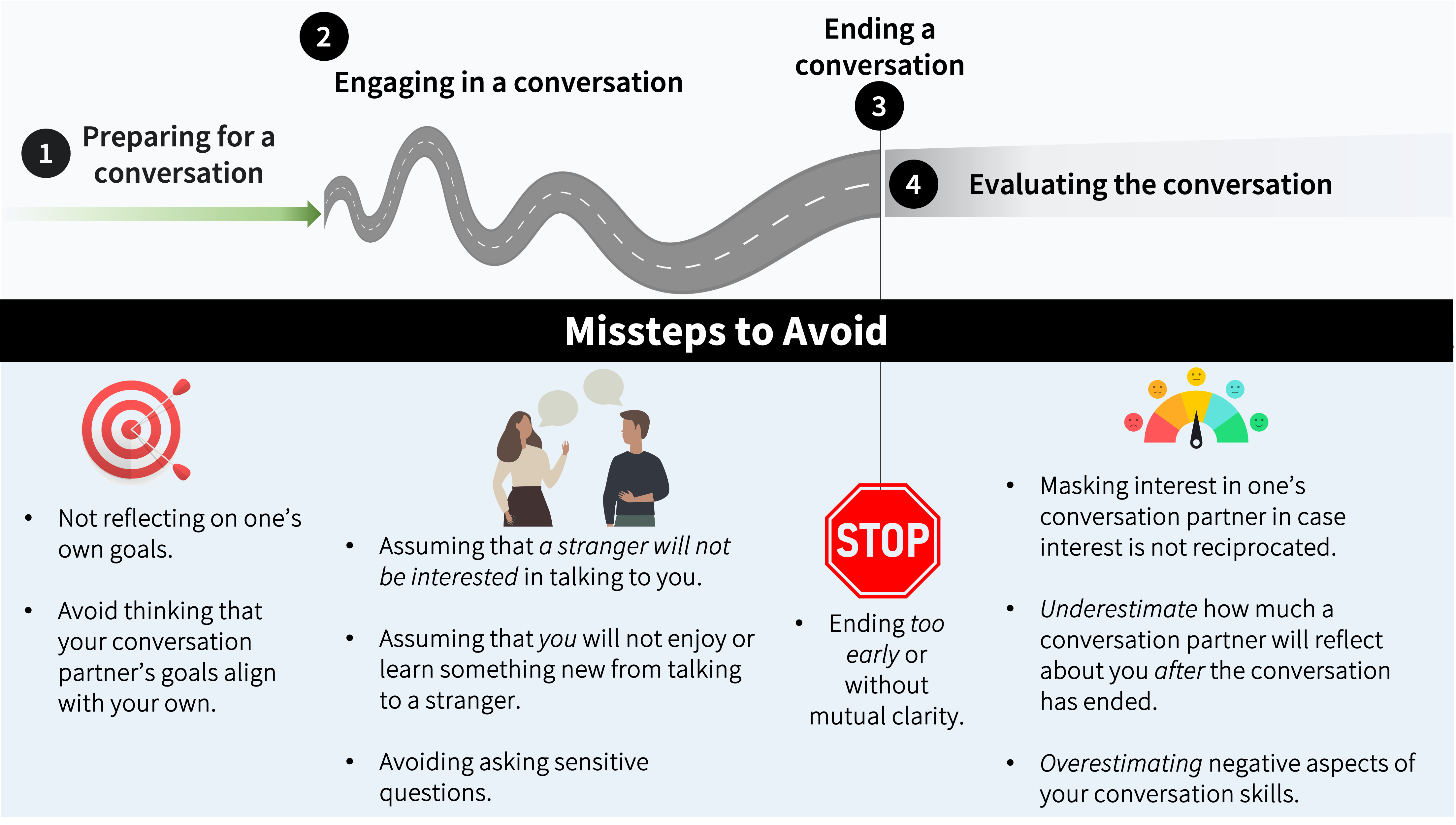
Creating meaningful conversations
A visual summary to capture ways in which we can have meaningful conversations and avoid common missteps. I made this graphic for the book chapter in ‘From Words to Bonds: The Science of Meaningful Conversations’ that our team contributed to in ‘The Quest for Meaning’.
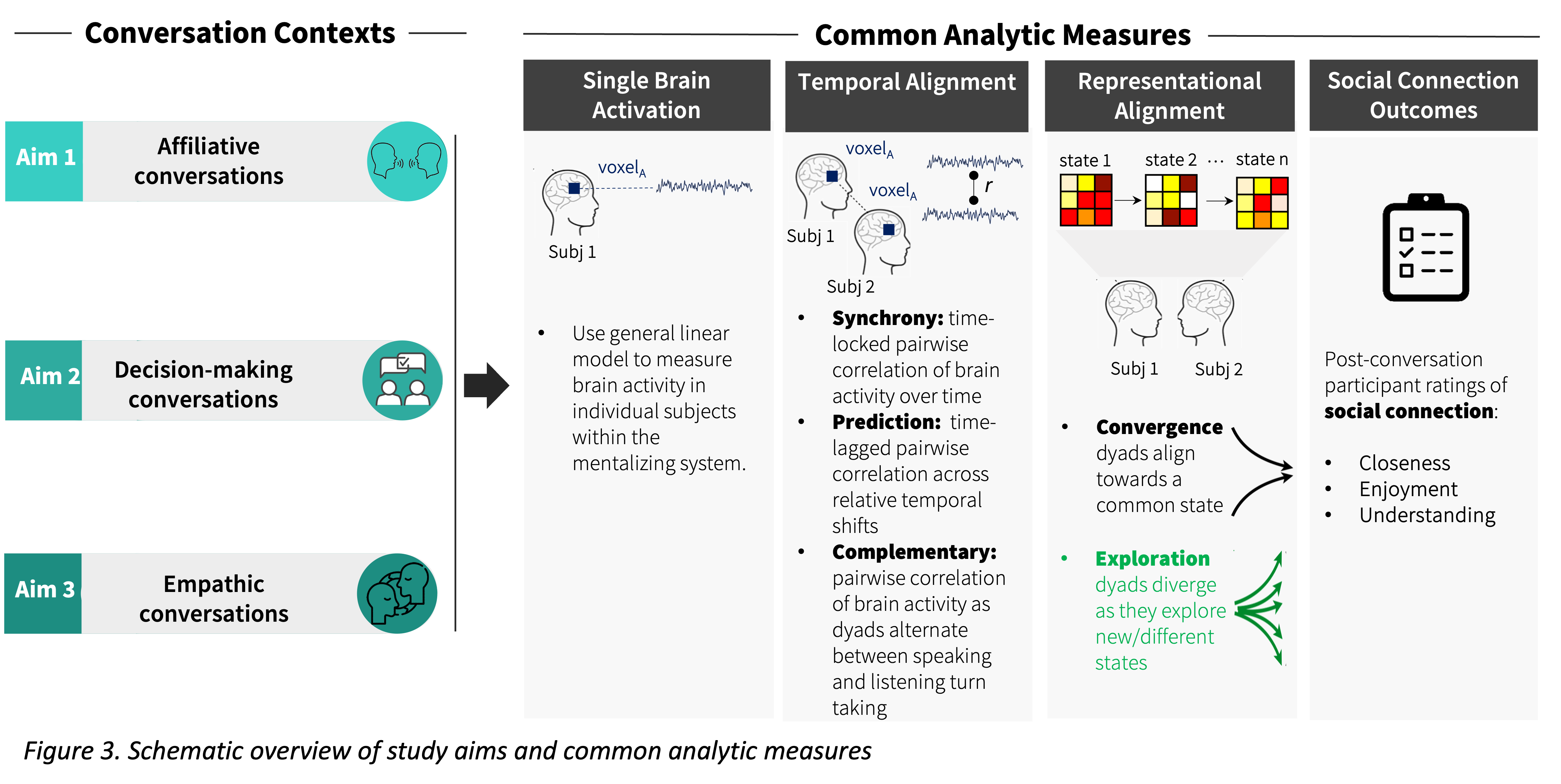
Grant proposal schematic
Writing grants is the bread and butter of the science we get to do! But I would argue that having visuals to convey our big ideas to potential funders is just as important. I have had the pleasure of taking the big ideas my collaborators and I have had and finding ways to sucinctly convey our larger scientific vision. This is one of my favorites!